Unplugged
Improving the search experience

Intro
I worked on this case study during Memorisely’s UX/UI Design immersive online Bootcamp. The goal of this case study was to improve the search experience of Unplugged.
Role
User Research
Product Strategy
UX Design
UI Design
Prototyping
Usability Testing
Tools
Notion
FigJam
Figma
Maze
Timeline
5 weeks
Problem
When searching for cabins, users currently filter through a series of drop-downs to find a cabin. It's not obvious for users which months are available and ideally, they'd like more flexibility when searching and booking a cabin.
Hypothesis
When a user wants to search for a cabin, they can only search by location which restricts the user from filtering through content that is most relevant to their preferences.
The Solution
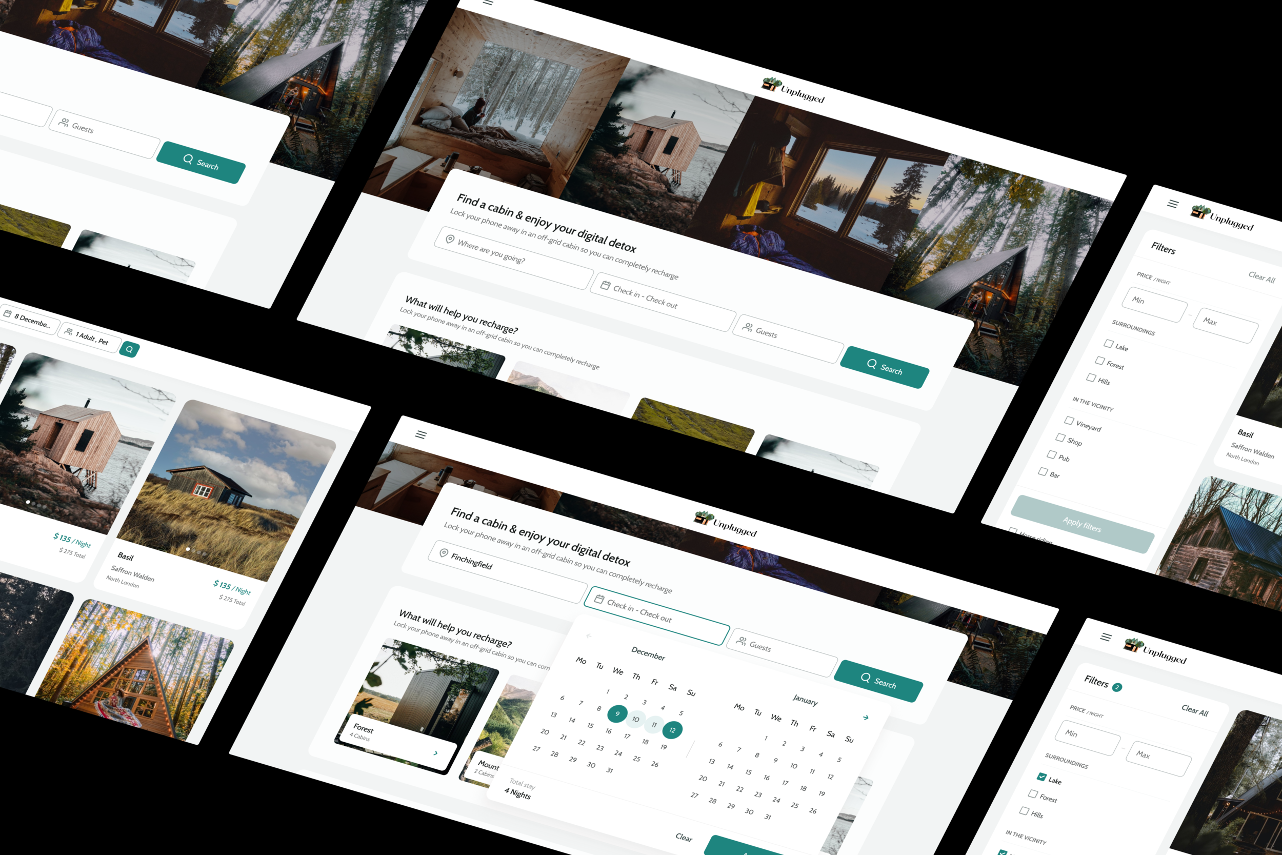
To solve the latter, I have adapted the website to match the classic booking platform in terms of layout, navigation, and hierarchy.
When it comes to functionalities, the changes were strictly limited to the search such as adding filters and improving the information architecture of the pages.
Questions & Observations
To help me better frame any problems with the product, I began by forming some questions and observations I have about the product.
Key Observations
Unfamiliar layout/hierarchy to other booking platforms.
There is no access to the search on any section within the landing page.
When scrolling down the search results page, no quick access to edit search criteria. And there is no pagination, which means the user will have to scroll back all the way to the top.
No available filter for the cabins.
Benchmark
In order to inform my future decisions, I did a benchmark on the popular booking platforms (Airbnb & Booking). This allowed me to come by the standards that could ease the search experience of Unplugged.
Key Learnings
Prominent search bar with main inputs (Location, Dates, Guests) accessible across the website.
Accessible CTA and clear copy
Offer content by collections for a more personalized content
+10 filters accessible on the search page
Possibility to search by map
Ability to browse the rental’s images from the search page
Displaying images of properties to immerse the user into the product— which is a good exploitation of the priming concept.
-
In the context of UX priming means designing an interface that guides the customer, subconsciously, towards a certain action.
Learn more →
Information Architecture
To begin, I mapped out the existing Information Architecture to uncover any pain points related to the search experience on Unplugged.
Customer Journey Map
Following the information architecture, I created a customer journey map to empathize with users and understand the core problems users experienced at different phases of the search.
Validated observations
When landing on unplugged
users are forced to learn this unfamiliar booking experience
which increases the mental labor & the drop risk.
-
Users spend most of their time on other sites. This means that users prefer your site to work the same way as all the other sites they already know.
How Might We
With a picture of the problem at hand starting to come into place, I jumped into the ideation phase and worked through the solution design model, identifying users’ actual behavior, and optimal behavior. This allowed me to form a how might we statement to begin forming a solution.
How might we help busy office workers in the city find a cabin that matches their criteria?
Ideation
To avoid following the first idea I conducted a series of ideation techniques. This allowed me to consider an array of solutions.
Following ideation, I mapped what could be improved or added to the experience.
User Flows
Following Ideation I created user flows of the existing experience and improved the flow based on the idea that fit with business and user goals
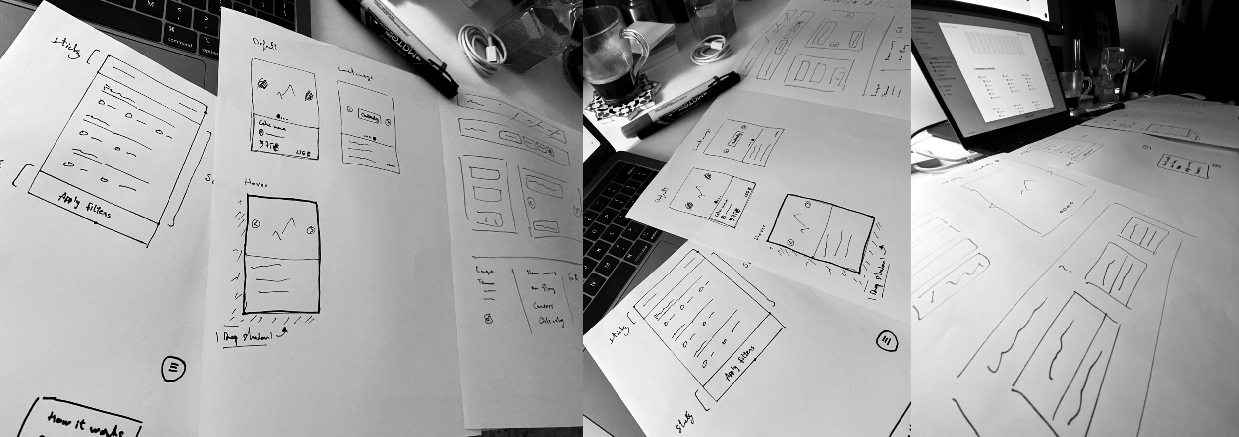
Sketching
To quickly visualize and iterate on the solutions prioritized, I started sketching on paper the different pages, components, and every element that will be part of the final solution.
High Fidelity Wireframes
I used a neutral color palette to avoid any decision bias and would use this to map the different interactions across the new user flow.
Styles & Components
I started creating the styles and components that will be needed for creating the final solutions.
High Fidelity Prototype
Below is the final version of the prototype that I created. I included interactions and transitions from Figma to match the new user flow.
Testing
To evaluate my solutions, I created two scenarios that will unveil any challenge users face when interacting with the product.
Scenario 1
You want to book a cabin near a lake and you’re planning on taking your dog with you.
Scenario 2
You want to book a cabin in the north of London from the 9th December to the 12th of December.
ongoing...


